The Metropolitan Diary
The Metropolitan Diary
Adobe InDesign
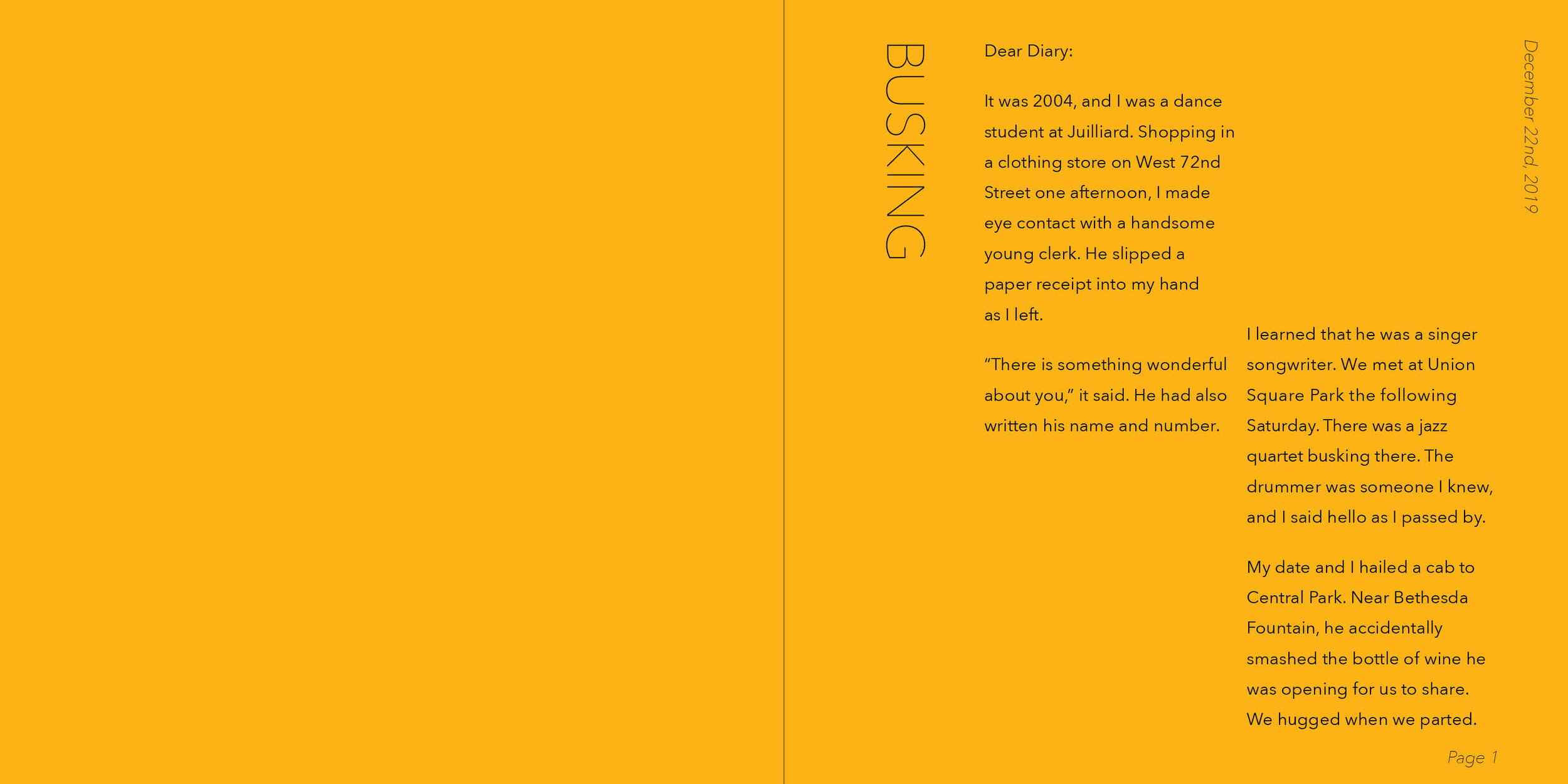
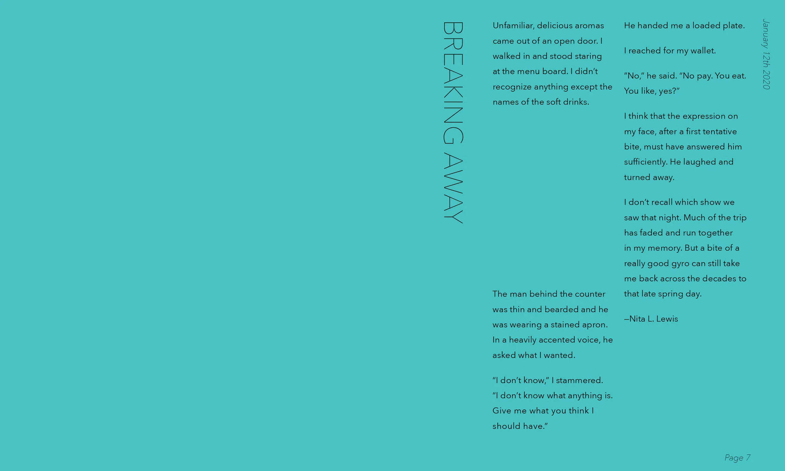
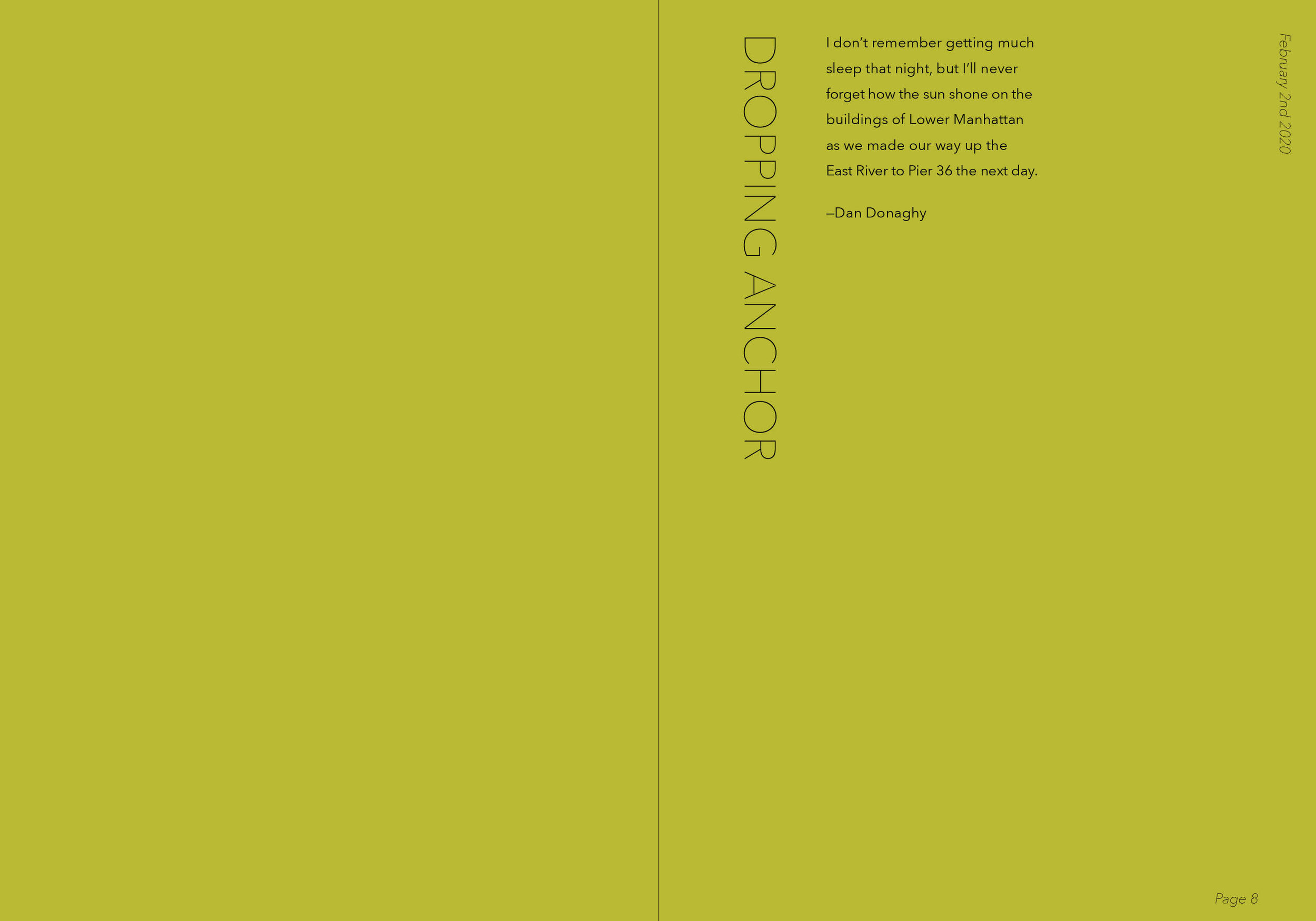
Exploration in storytelling through typography. All content comes from the famed New York Times weekly column “The Metropolitan Diary”. The focus of this project was to explore how to develop a typographical identity that could be used repeatedly for content that varies in length. By using just two weights of the same typeface (Avenir Next) the goal was to direct the viewers focus to the variation in the arrangement of each spread.


